Png to STL: How to Make a 3D Name Sign
Learn how to turn a name design into a connected 3D print, choose between a baseline bar and plate, and prepare the STL for slicing with png to stl.
If you came looking for png to stl, this guide explains how to create a name sign whose letters print as one connected piece, then download and prepare the STL for slicing.
Loose printed letters are easy to lose, misalign, or knock off a shelf. I make a name sign as one connected print by choosing a readable font, giving the letters enough depth, and deciding whether a baseline bar or a shaped plate suits the design.
The short version
- Use a Connected base for a word held together by a bar along the baseline. Use Plate when you want the letters raised from a solid sign backing.
- Choose a bold font for small lettering, then check the preview’s dimensions against the space where the sign will go.
- Give the letters a practical depth. A shallow raised sign needs less depth than letters meant to stand on their own.
- Download the STL, check its size and orientation, then slice it lying flat on its back.
Decide what “one piece” should look like
A name sign needs more than letters that happen to touch in the preview. A dot over an i, a gap between letters, or a second line of text can leave separate pieces on the print bed. Those pieces may print perfectly, but you still have to position and attach them afterward.
SupaVoxel’s 3D text STL generator lets you type the name and choose among loose letters, a baseline connection, and a plate that follows the lettering’s outline. It runs in the browser and is free to use without an account.
I choose the connection before fussing over the font. Connected adds a rounded bar along each baseline; multi-line text also gets a spine. The bar keeps the word together while leaving much of the space around the letters open. It is a good fit when I want the lettering itself to dominate.
Plate puts the letters on a backing shaped around their outline. It reads more like a conventional sign and gives me a continuous surface to handle and position. None exports loose letters, which is useful if I intend to place them individually, but it does not solve the one-piece-sign problem. In particular, dots over i and j remain separate.
Step 1: Type the name and choose a font
The generator accepts up to 60 characters. Press Enter for another centered line if the sign needs one, but think about the printed object rather than just the text on screen: an extra line changes the sign’s overall footprint. Read the dimensions shown in the preview before committing to a layout.
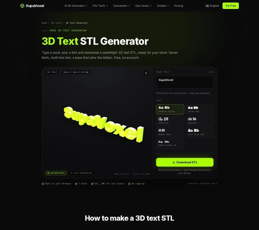
The 3D Text Generator shows the lettering, base choices, and finished dimensions before download.
Font choice affects printability as much as appearance. Archivo Black, Titan One, and Alfa Slab One are sensible starting points for compact, bold names. Pacifico and Lobster give a more flowing look, but their thinner strokes need more care at small sizes. The other available faces are Bebas Neue and Press Start 2P.
For letters below 15 mm high, I start with a bold face. Below 10 mm, thin fonts such as Lobster can lose detail with a 0.4 mm nozzle. That is not a problem a connecting base can fix: the base holds parts together, but it cannot restore a stroke too fine to print clearly.
Look closely at counters—the openings inside letters such as O, A, and e. The tool builds from font outlines, so those openings exist in the model. At a small finished size, though, the printed result still depends on the width of the surrounding strokes and the slicer’s ability to resolve the gap. If a name looks crowded, increase letter spacing or choose a sturdier font rather than assuming every narrow opening will survive.
Step 2: Set the size and depth for the job
Letter height is the capital height, adjustable from 5 to 80 mm; its default is 20 mm. That is different from the finished sign’s width. A long name can exceed the space you have even when the letter height sounds modest, so use the live dimensions to check the full design.
Depth runs from 1 to 30 mm and defaults to 8 mm. For raised lettering on a plate, 3–5 mm can be enough. Free-standing letters need more depth to stand without tipping; the page recommends at least 5 mm. I would not choose a 1 mm depth for letters I expect to stand, because thin standing letters can snap.
Letter spacing ranges from −10% to 40%. I begin at its default of 0%, then try an additional 5–10% for script if neighboring letters are merging. More spacing may improve legibility, but it also lengthens the sign. Check the displayed width again after changing it.
Bevel is adjustable from 0 to 1.2 mm, with a 0.5 mm default. It chamfers the top edge only; it does not round the whole letter. Keep that distinction in mind with thin strokes. A large bevel can eat into the top surface, so avoid pushing it beyond a third of the stroke width on a delicate font.
Step 3: Compare Connected with Plate, then export
Switch between Connected and Plate in the preview before downloading. Ask a simple question: should the space around the name remain open, or should the name sit on a backing?
With Connected, inspect the baseline bar as part of the design. It keeps the letters and dots together without filling the whole silhouette. On a multi-line sign, account for the spine joining the lines. With Plate, inspect the outer edge of the backing and how much surface it puts around the text. Plate thickness can be set from 1 to 6 mm and defaults to 2 mm.
Download the STL when the silhouette and dimensions are right. The generator checks its files as closed, manifold geometry. That matters because a slicer needs an unambiguous solid: an open edge can leave it guessing which regions are inside the object. A valid mesh is not, however, a substitute for checking that the sign fits your intended location.
The on-page preview stands the lettering upright so it is easy to read. The downloaded model lies flat, Z-up, for printing. That orientation is intentional. Print the sign flat on its back; the page recommends doing so without supports. For slicing, its guidance is 0.2 mm layers for signs or 0.12 mm for small text.
Check the file before slicing
I open a downloaded sign for a quick visual check even when the generator reports a watertight file. The 3D Tools collection includes an STL viewer for inspecting a model and checking its size. Rotate the sign and confirm that the dots, lines, connection, and backing match the version you meant to export.
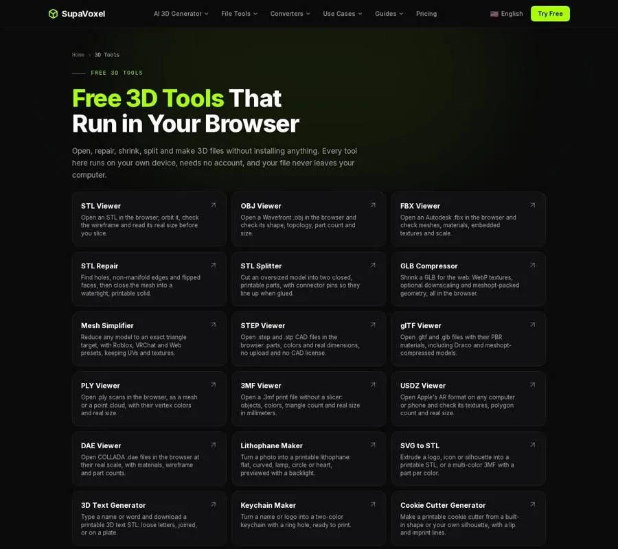
The 3D Tools page groups viewers and other file tools for checking a model before print preparation.
Pay particular attention to scale. STL stores geometry but does not specify units. The generator displays dimensions in millimeters, but an STL from another source might have been modeled with a different unit assumption. If the size in your slicer looks implausible, stop and compare its dimensions with the sign you planned rather than scaling by eye.
If you already have a name model in another format instead of typed text, the 3D File Converter collection helps you choose a target format for printing. Conversion will not add a baseline bar or plate to disconnected letters. It may also discard information: STL cannot carry color, while 3MF can retain per-object colors and millimeter units. Choose the format for what the receiving software needs, then inspect the result.
When a name sign is the wrong starting point
A sign and a keychain can both carry a name, but they need different geometry. A keychain needs a hole, enough material around that hole, and a size that includes the ring attachment. Do not rely on a baseline bar or a sign plate to provide those features.
For that job, SupaVoxel’s custom keychain maker builds a name or logo tag with a ring hole, border, and raised design. It lets you set the finished width including the ring. The name option takes a single line of up to 24 characters, so it is a better fit for a small tag than for a multi-line display sign.
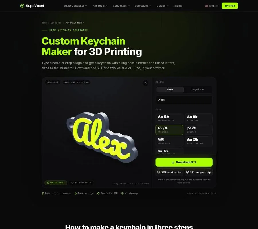
The Keychain Maker shows a name on a tag with its ring attachment included in the design.
For a sign, return to the simpler decision: an exposed baseline connection or a shaped backing. Either gives you a single object to lift from the bed and position, without arranging loose letters afterward.
FAQ
Will Connected attach the dot over an i?
Yes. Its baseline connection is designed to keep dots and letters together. With Base set to None, those dots print as separate pieces.
Can I upload my own font?
No. The text generator uses its seven bundled fonts. If a particular typeface is essential, the page suggests converting that text to vector outlines and using an SVG-to-STL workflow instead.
Does a watertight STL mean the sign will print at the right size?
No. Watertight describes the mesh, not whether its dimensions suit your project. Check the displayed size before download and confirm the dimensions again in your viewer or slicer.
Want to try it yourself?
Try Supavoxel →